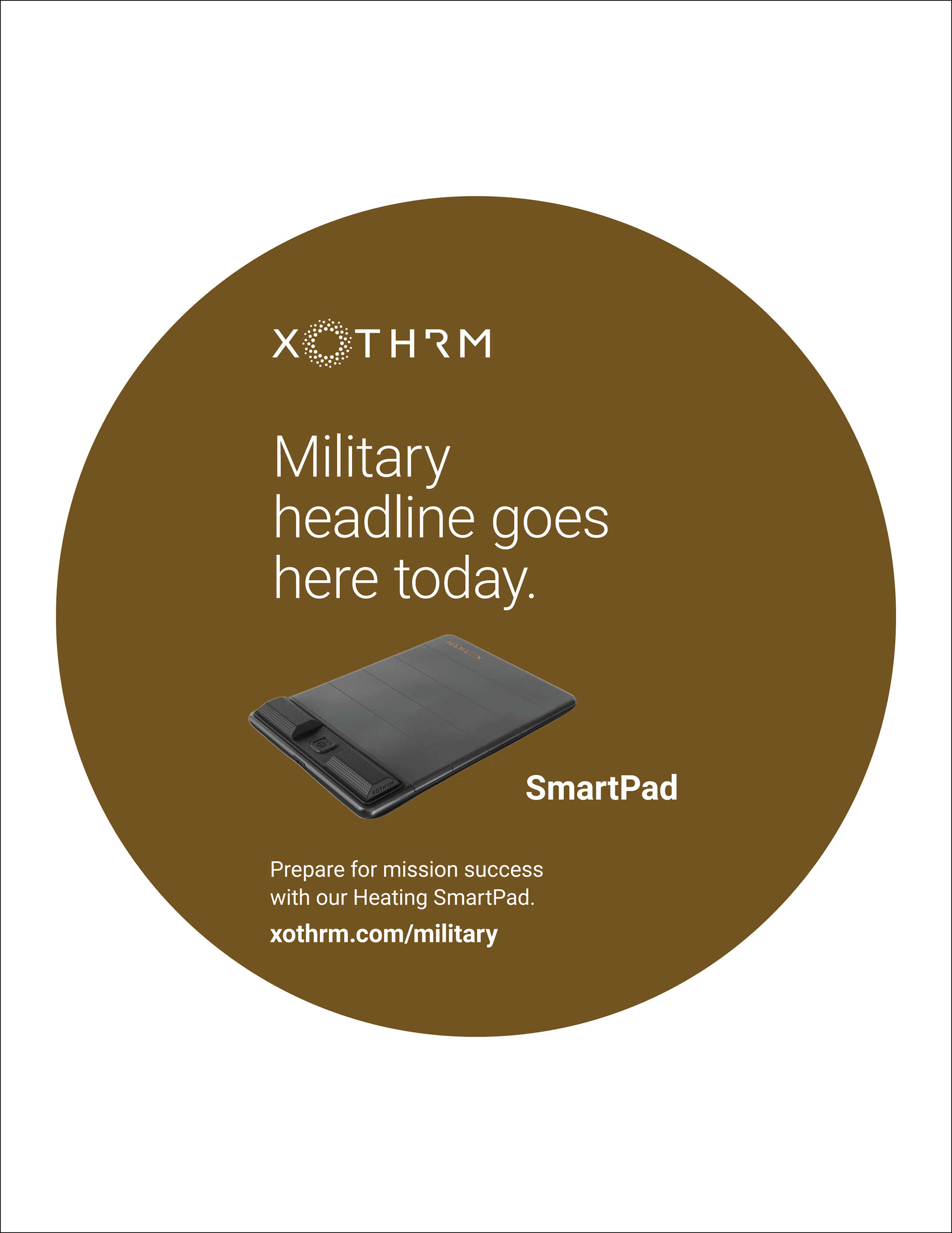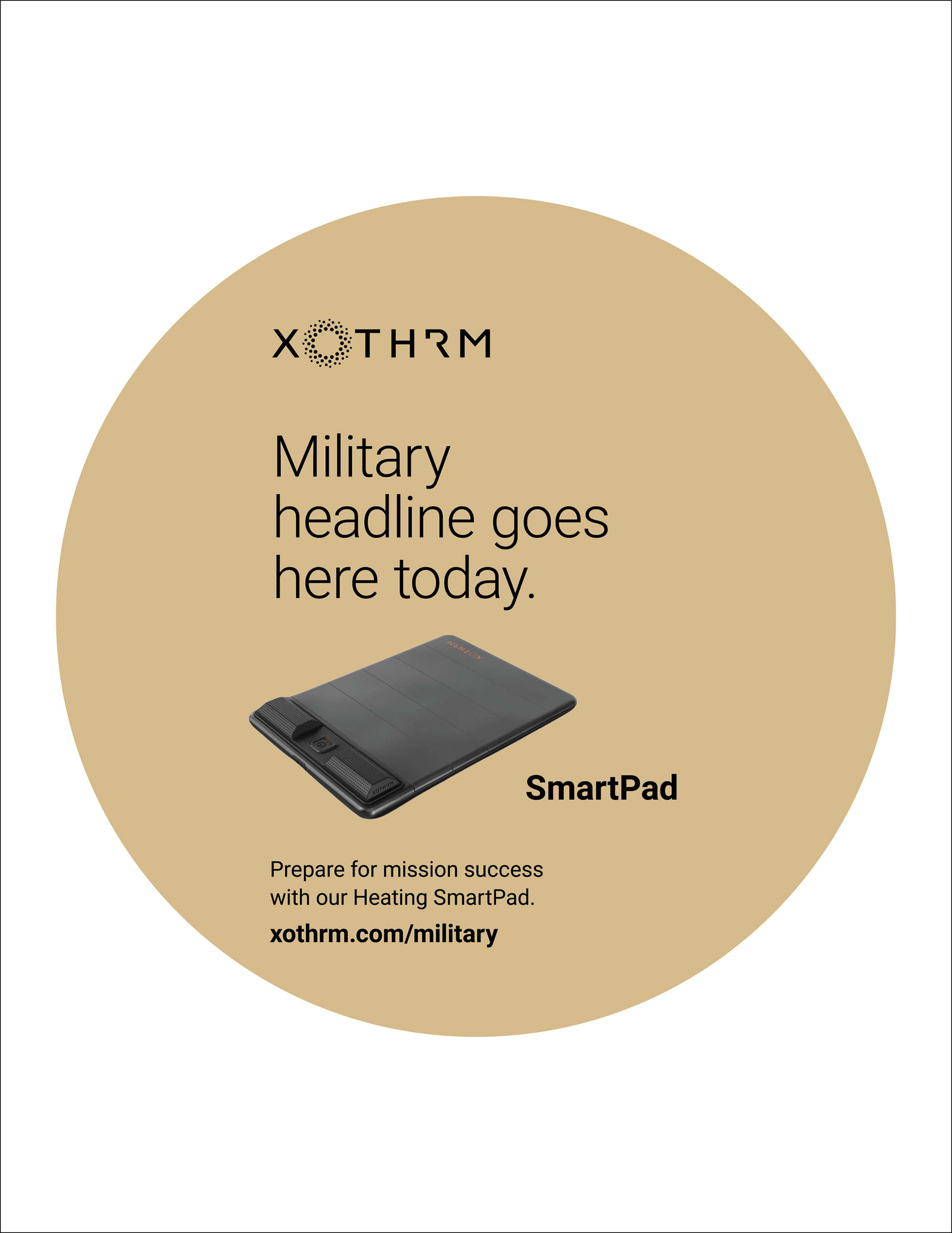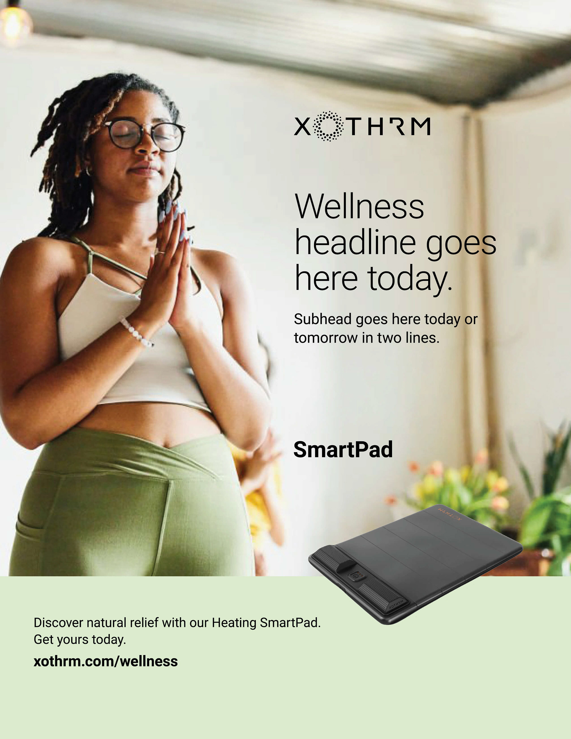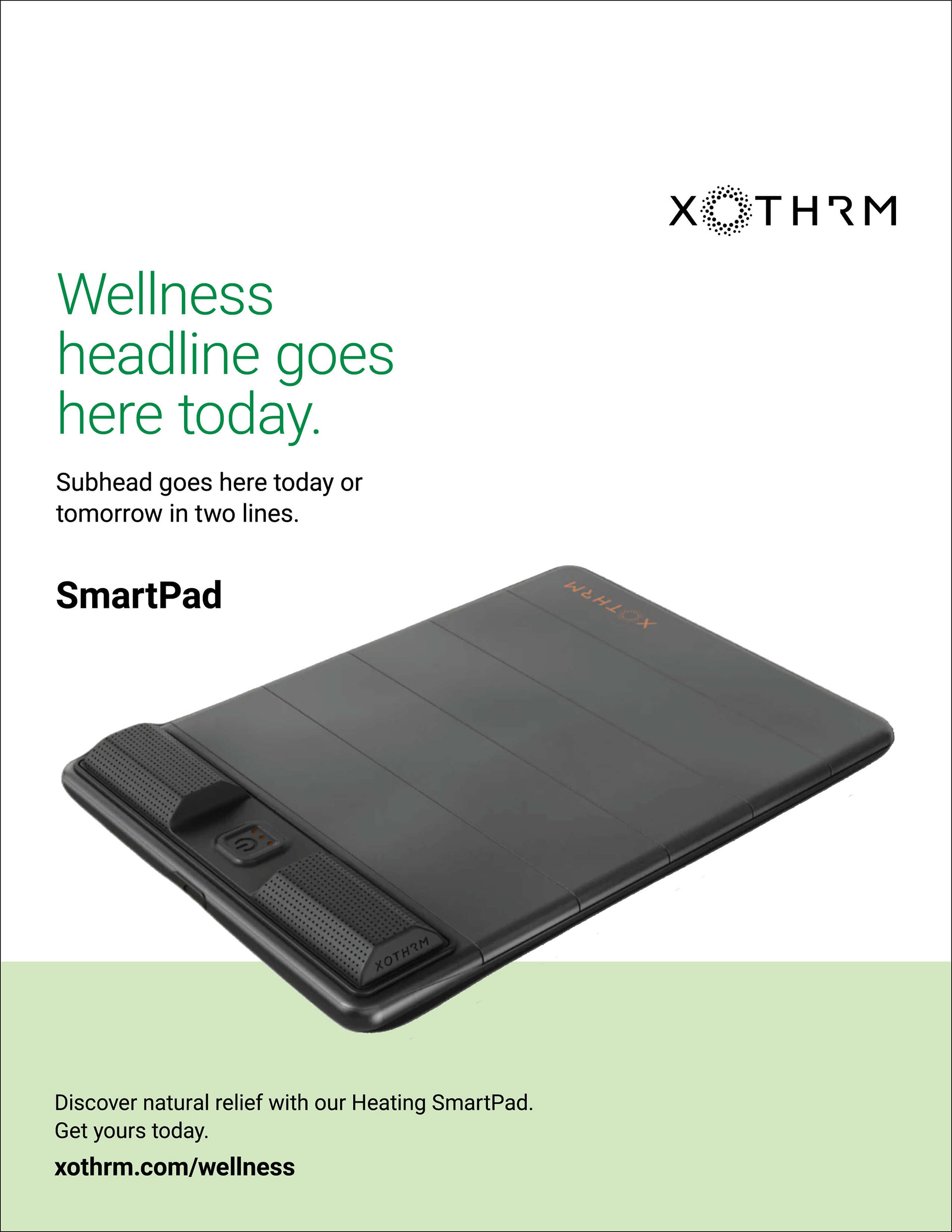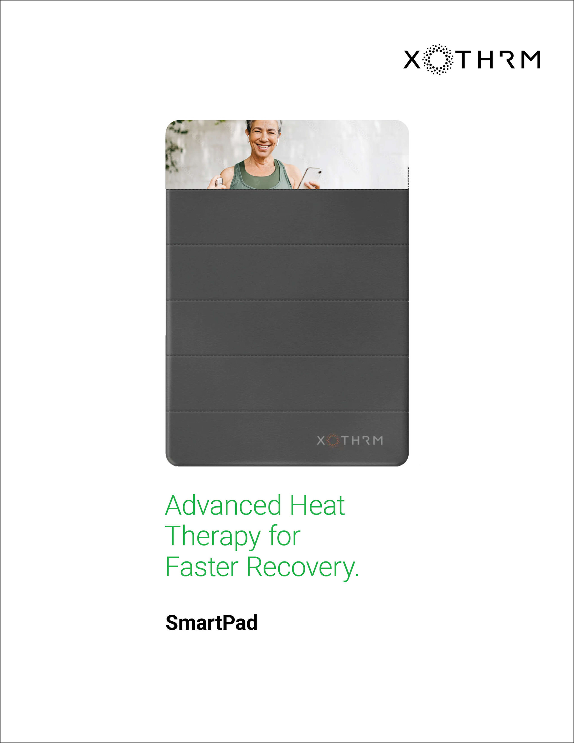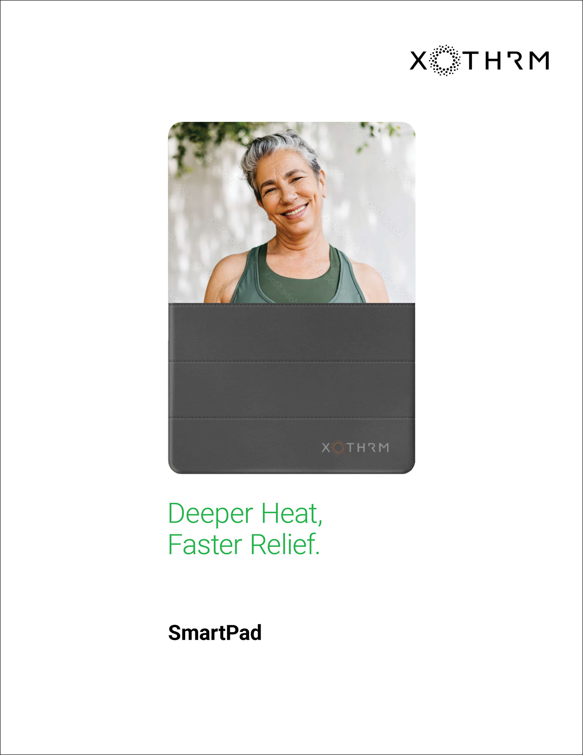
Xothrm
Product Campaign Design System
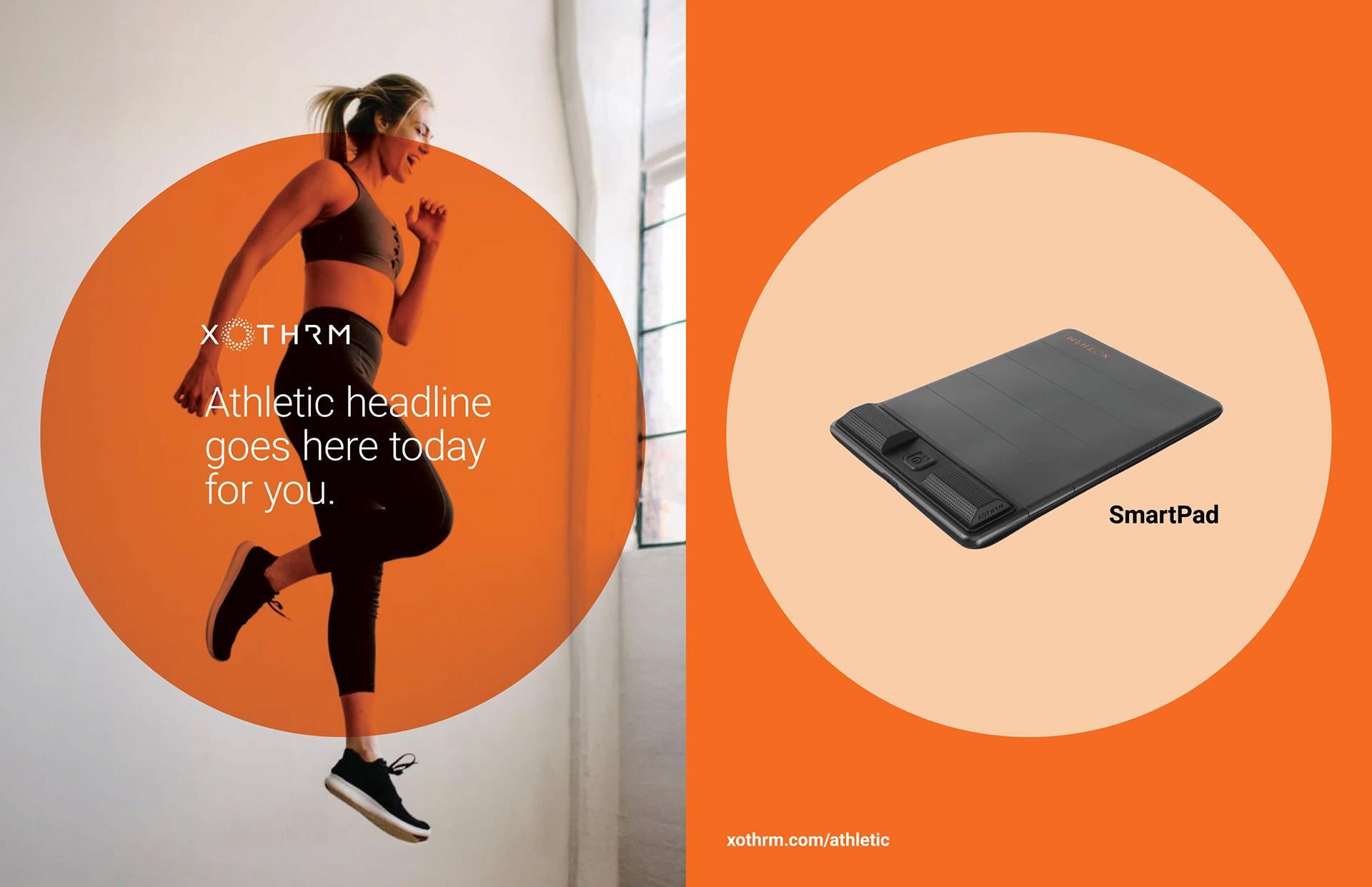
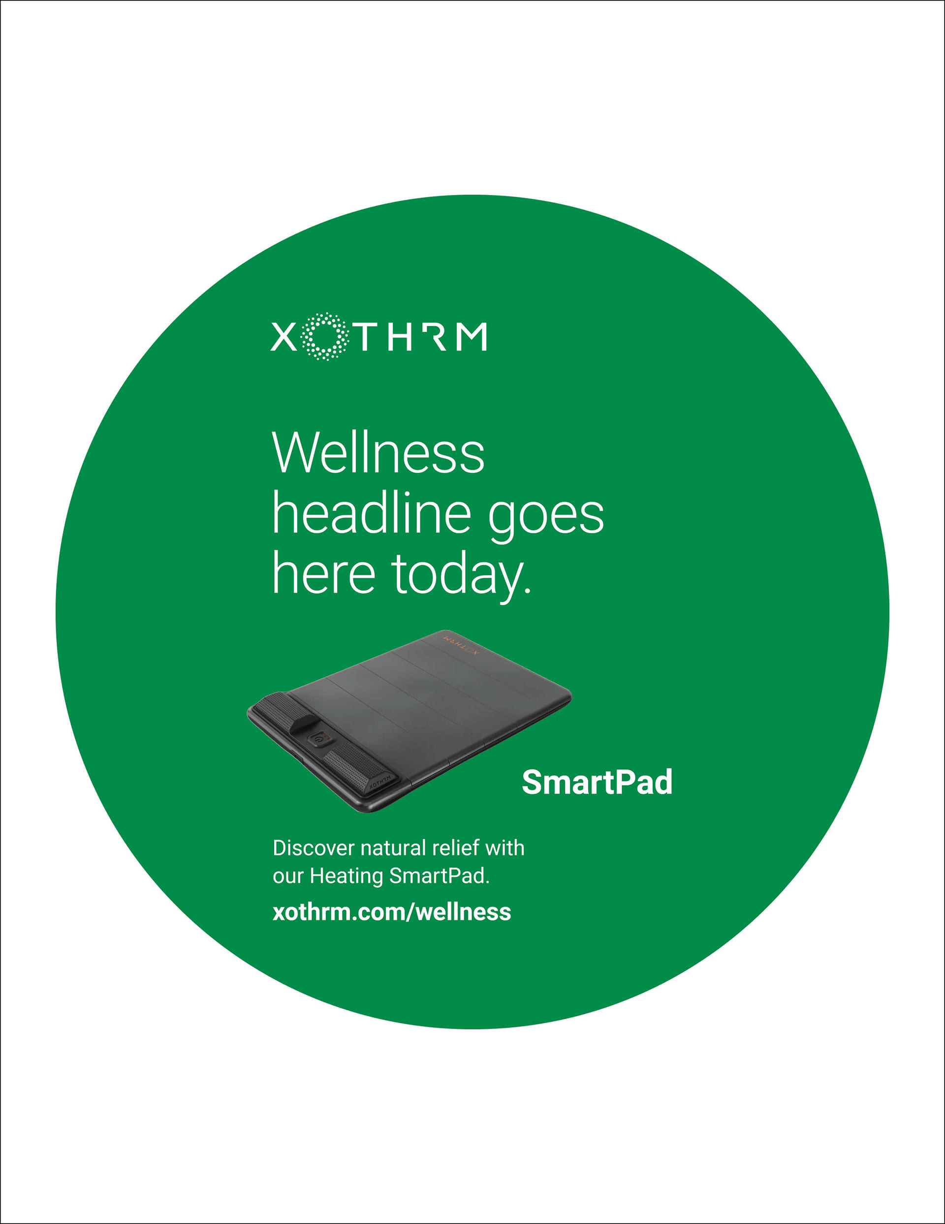
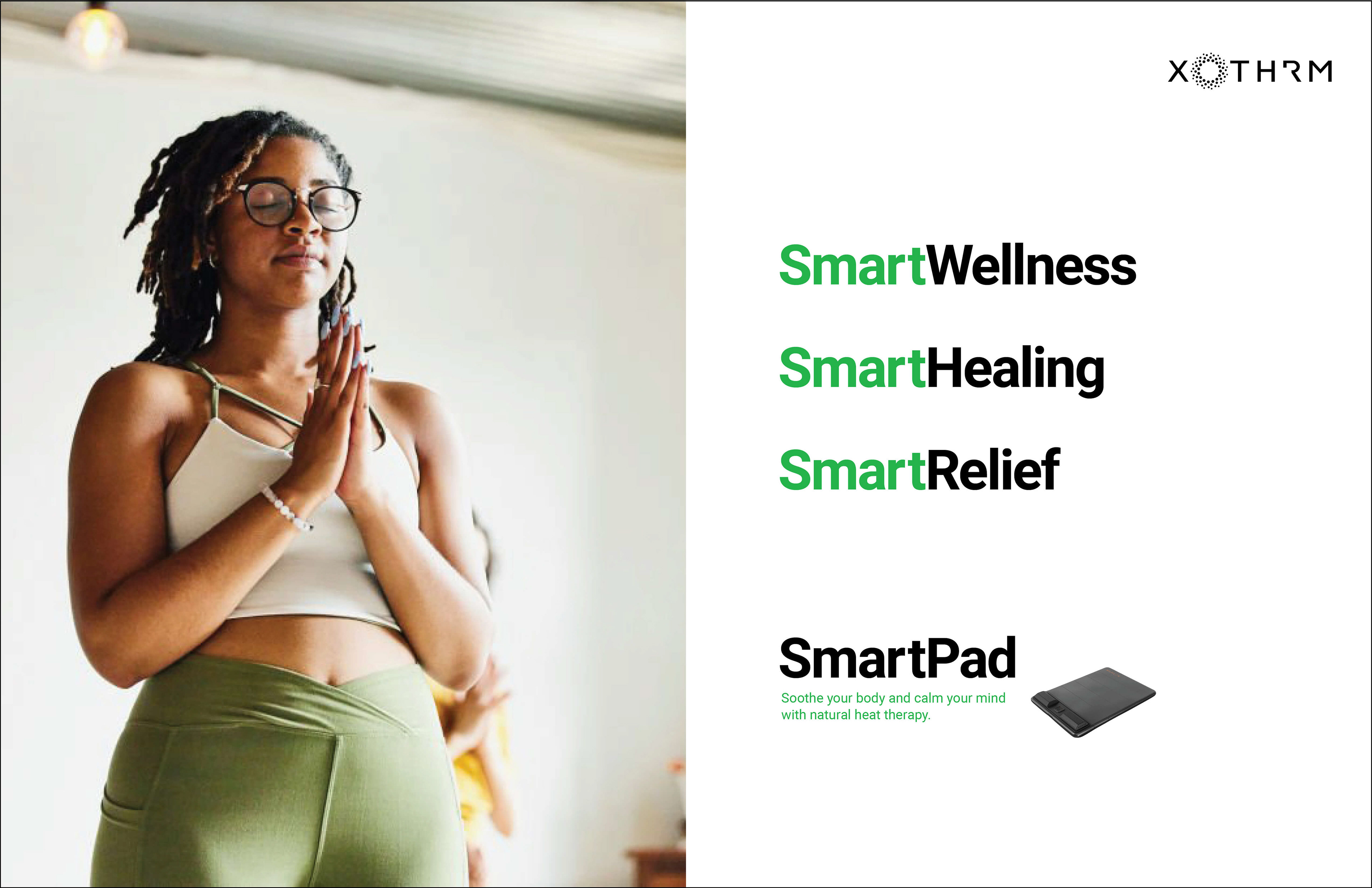
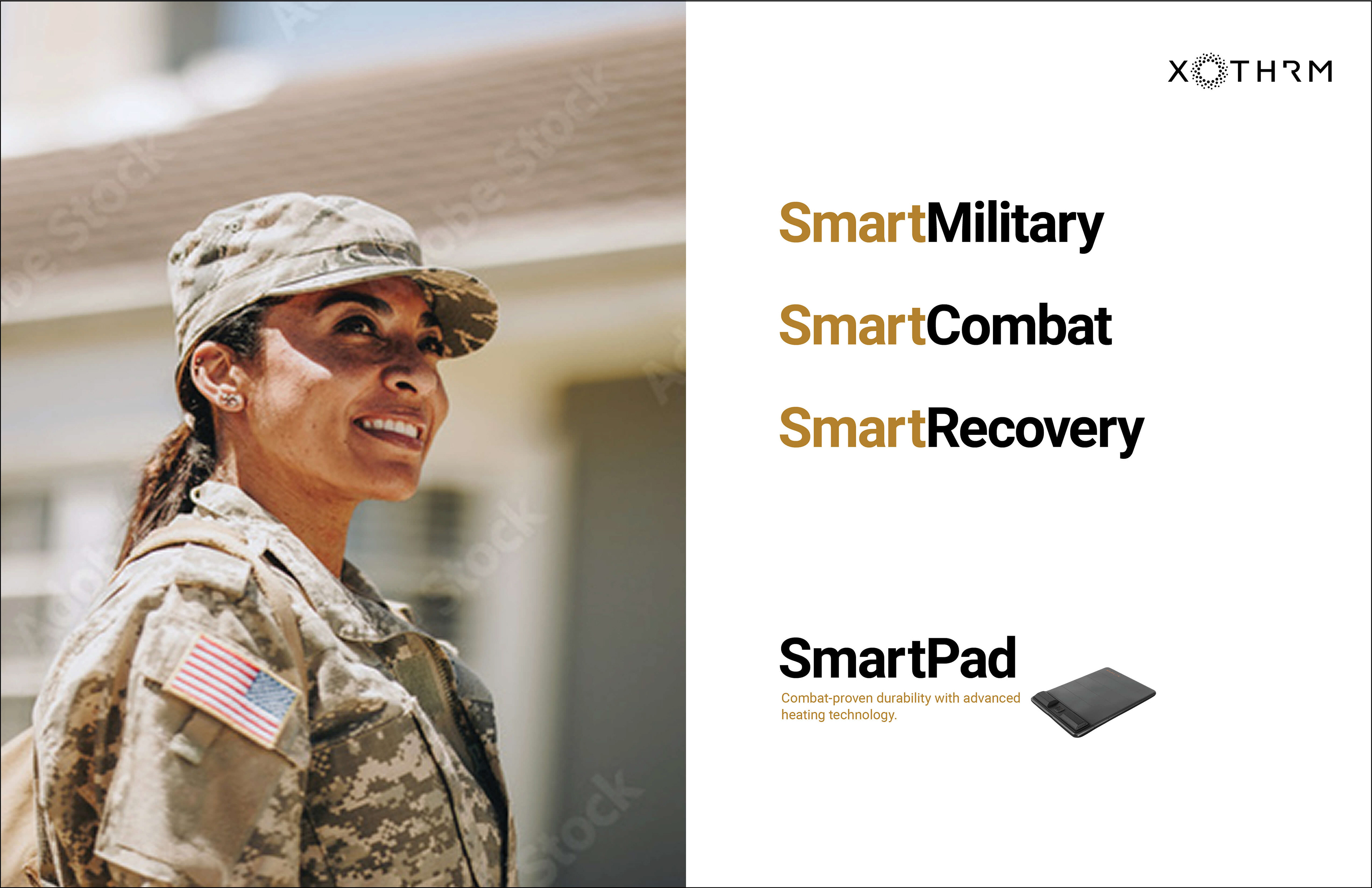
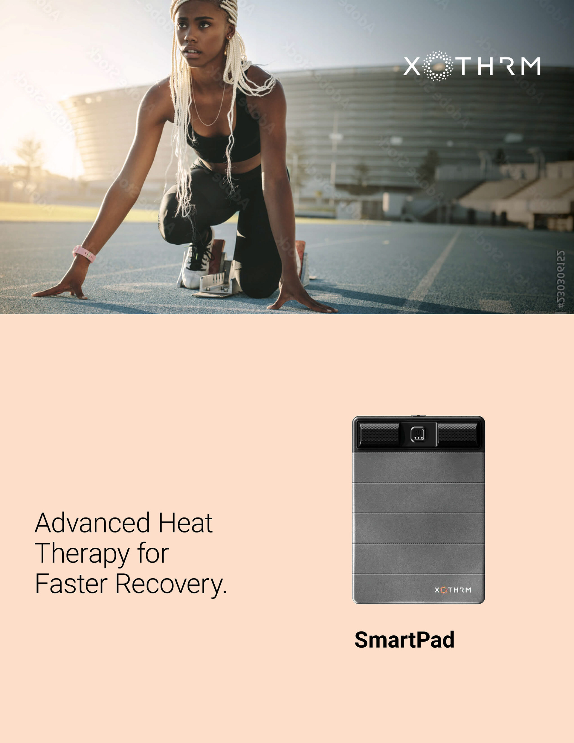
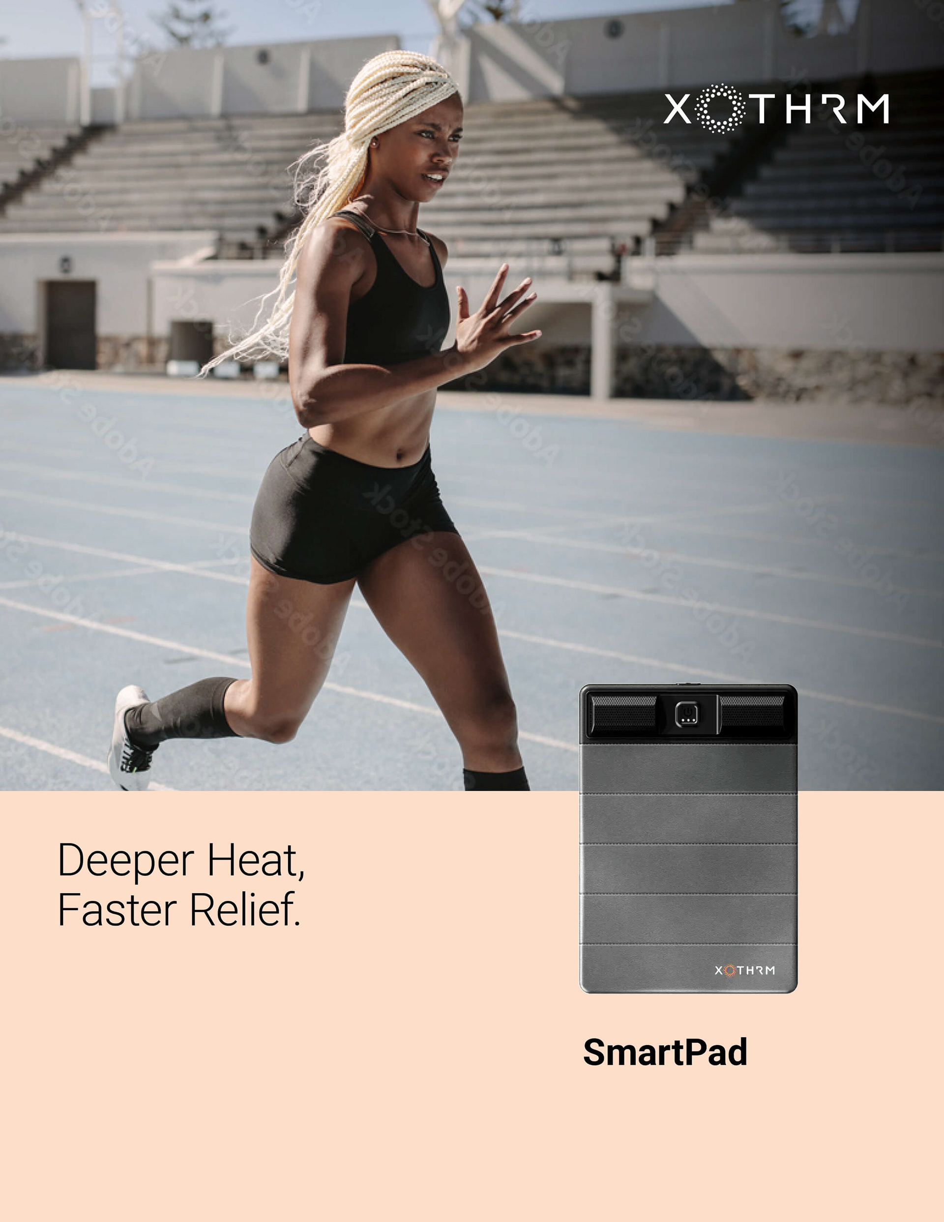
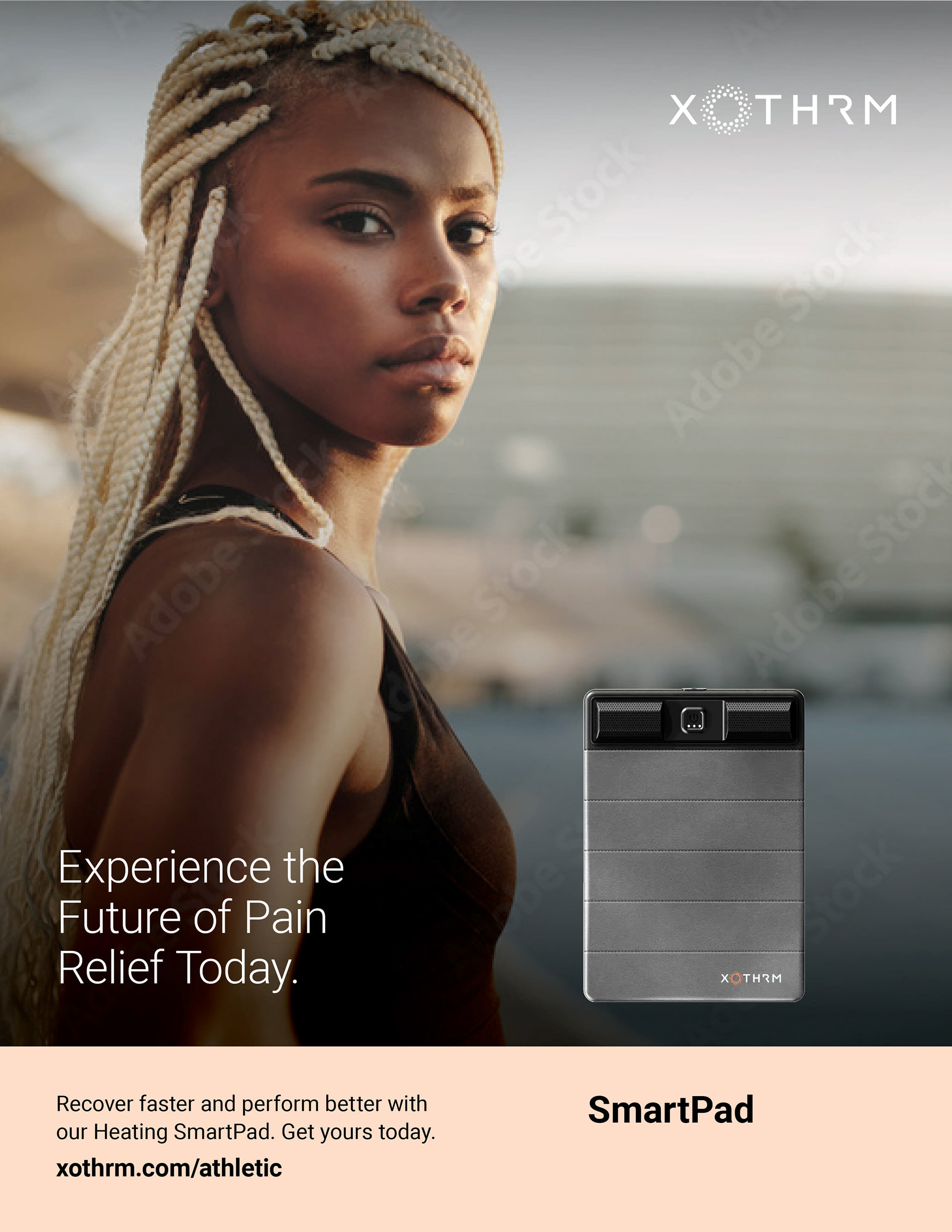
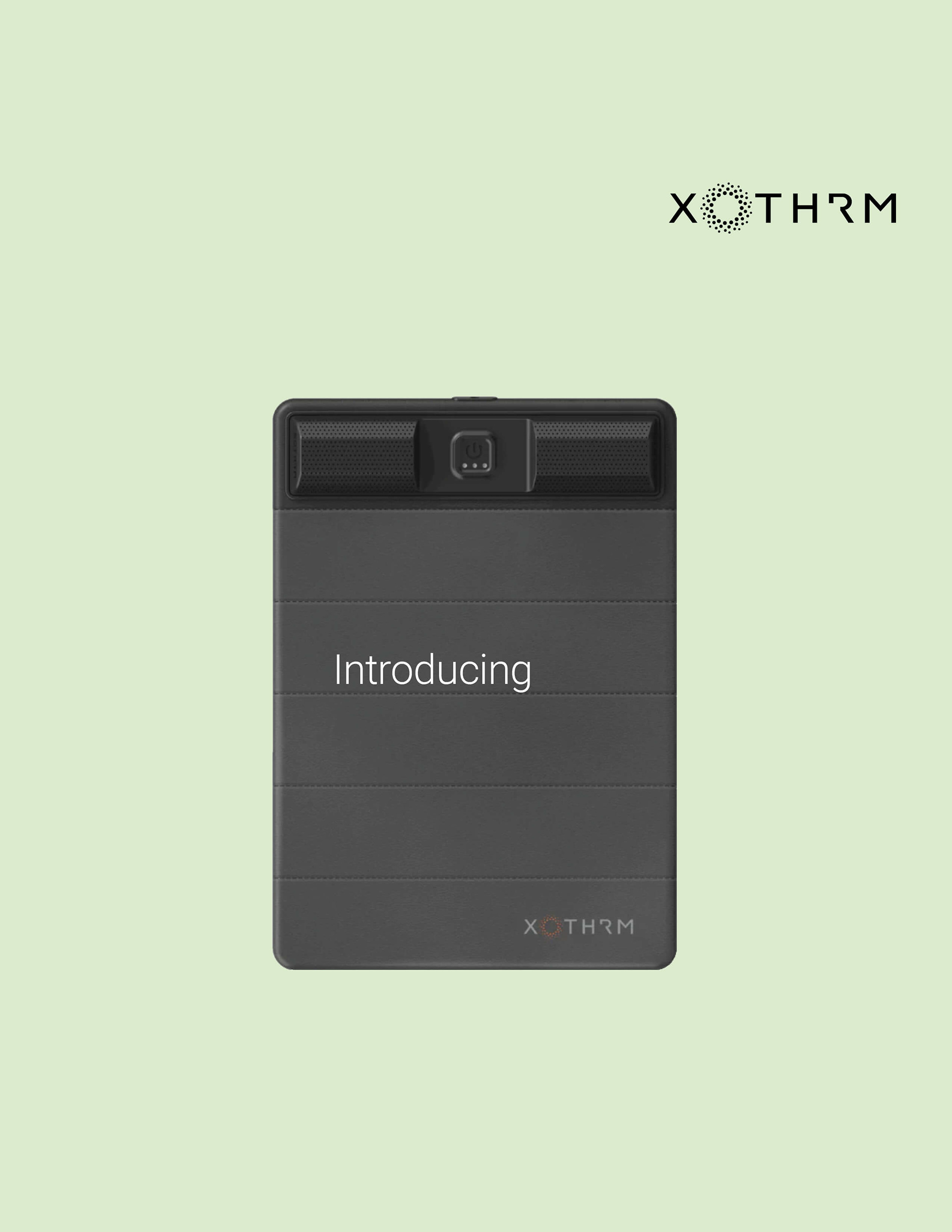
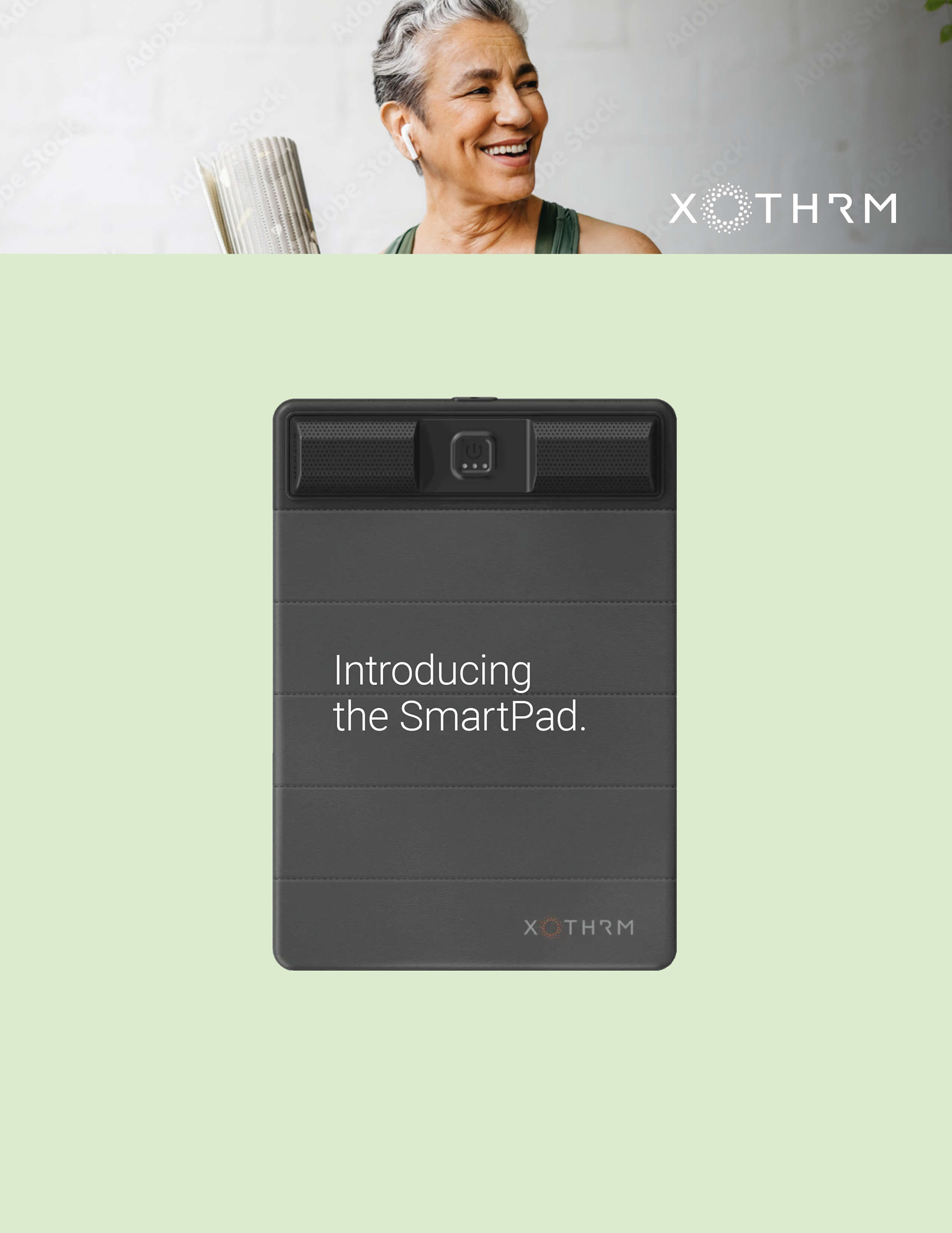
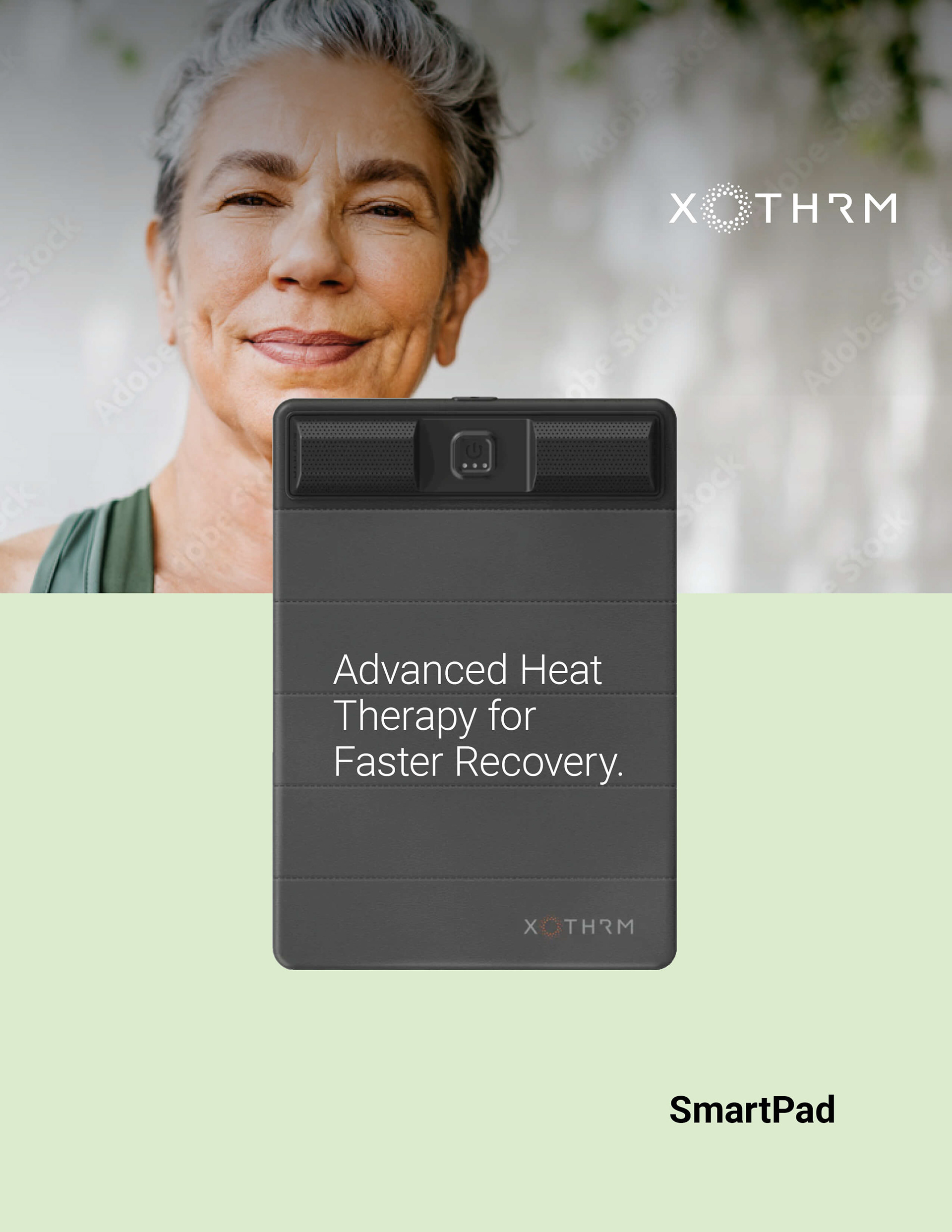
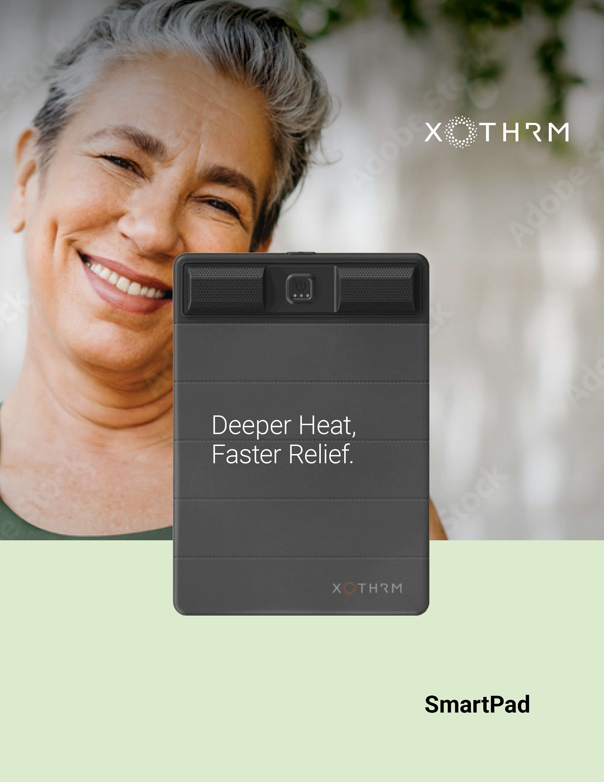
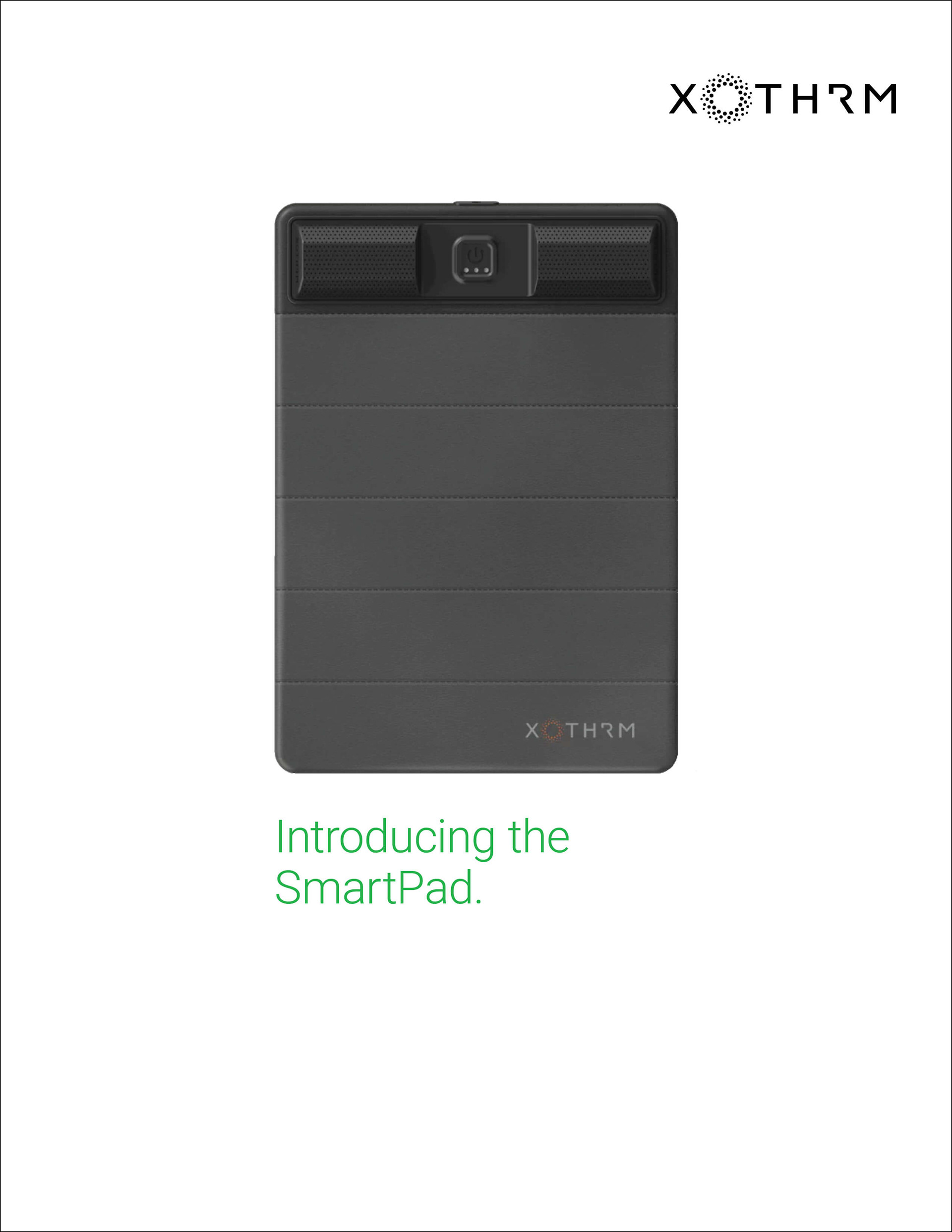
Developed a series of brand design explorations and campaign concepts for XOTHRM, showcasing a flexible visual system tailored to athletes, home use, wellness, and military audiences. Each concept demonstrates how a single product can adapt across distinct lifestyles while maintaining a cohesive brand presence through consistent layout, typography, and color-driven storytelling.
Includes: Product • Branding • Campaign