Yerba Prima
Packaging Redesign and Product System
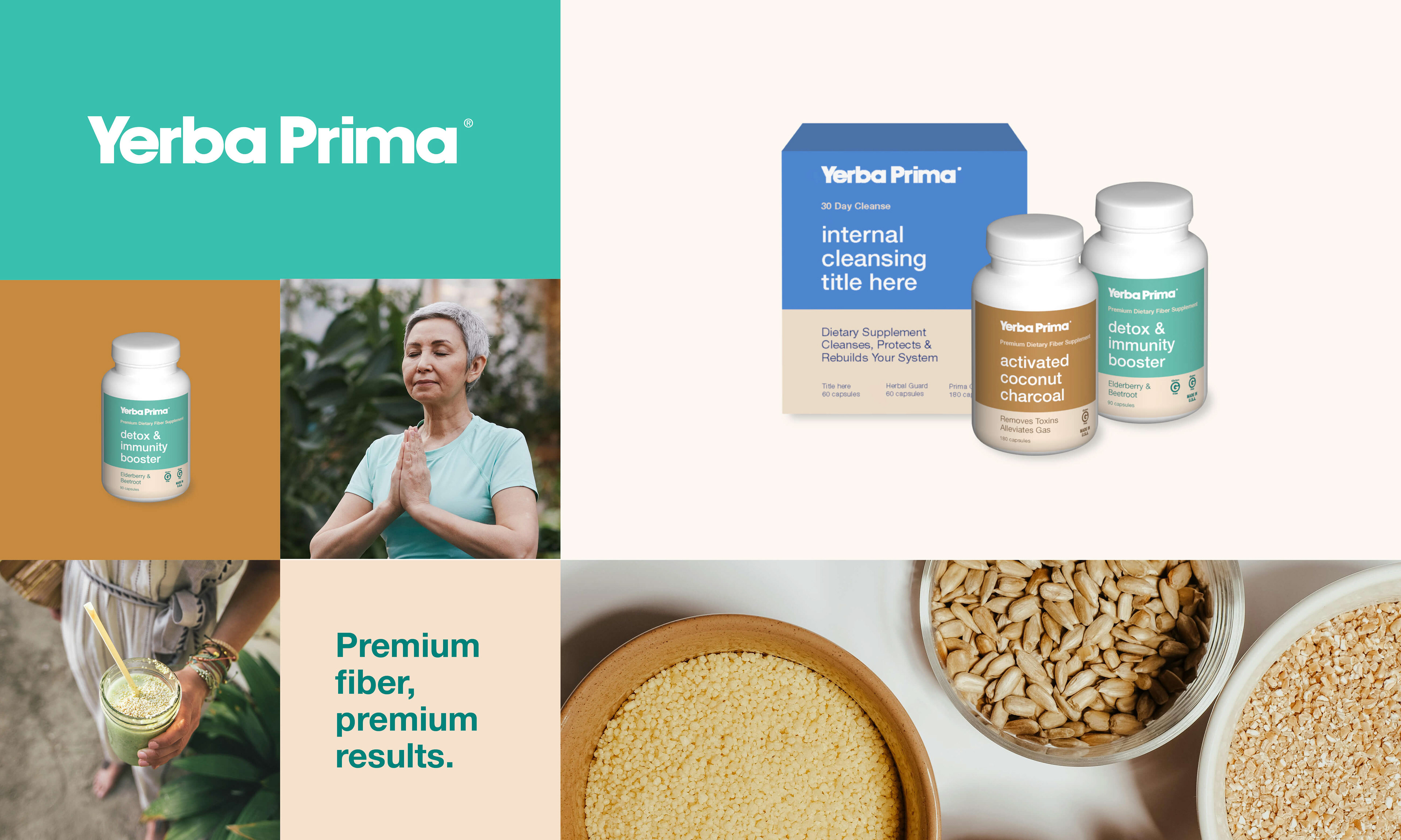
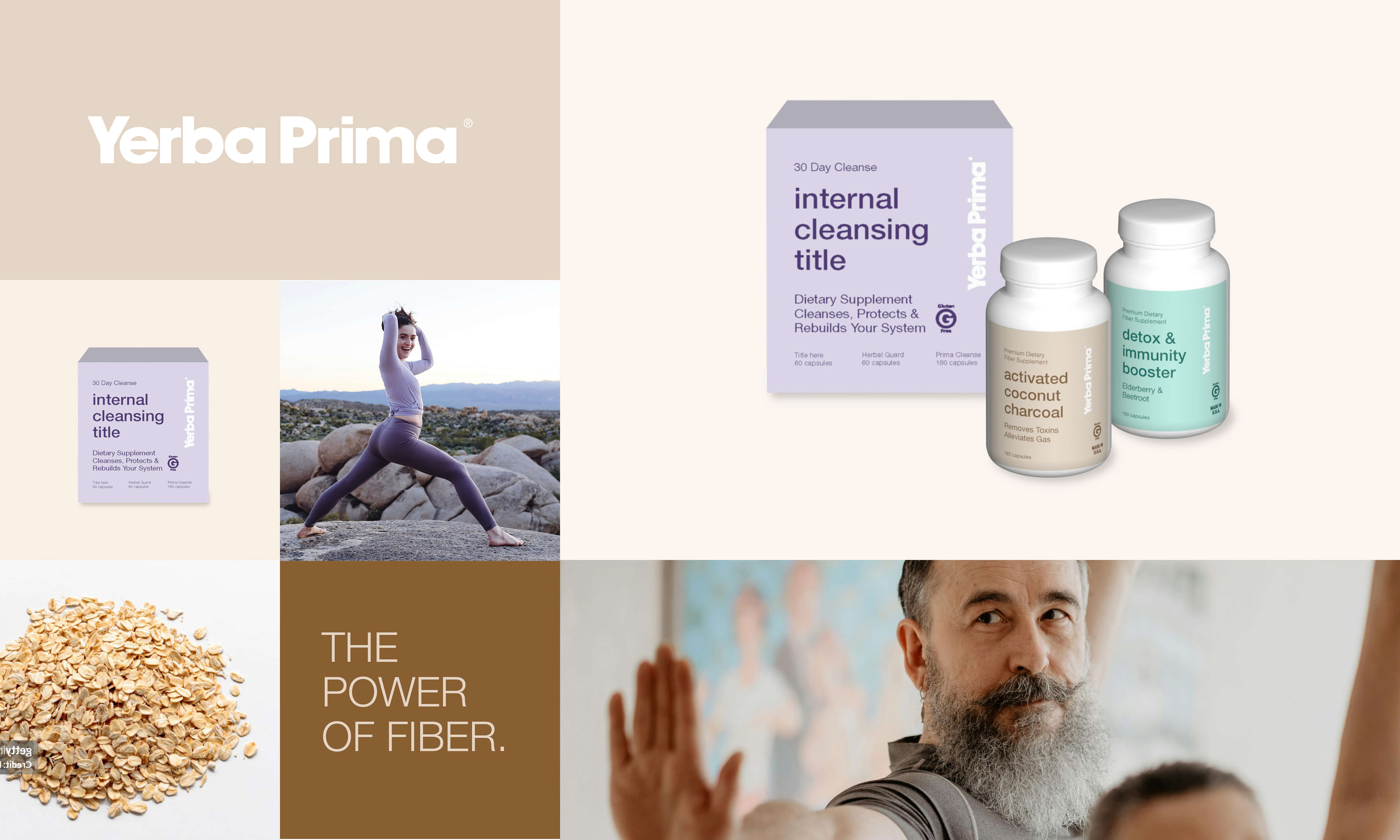
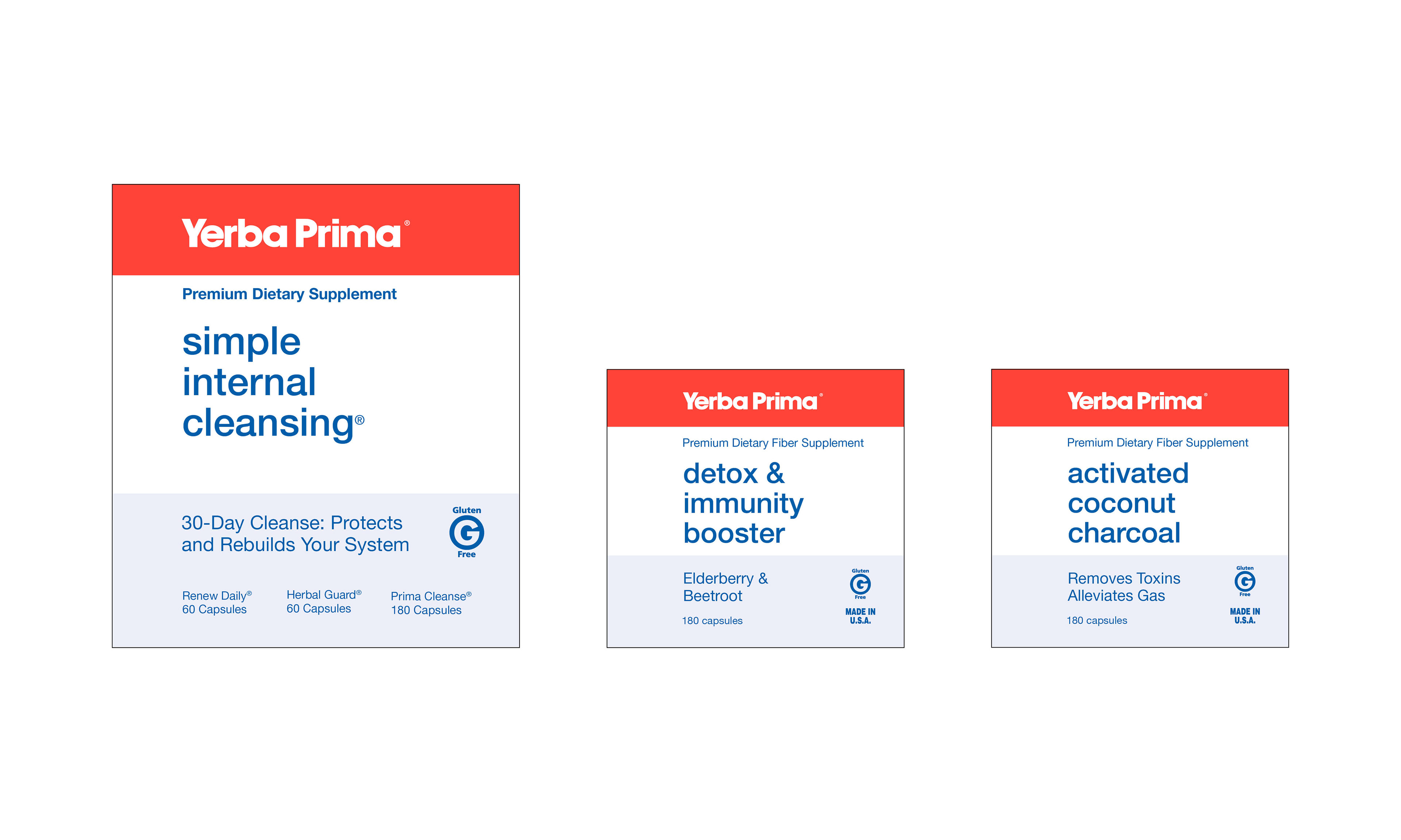
Developed an evolutionary packaging redesign for Yerba Prima that builds on the brand’s established visual language while introducing a cleaner, more modern system. The updated packaging retains familiar brand elements and hierarchy while improving clarity, consistency, and shelf presence across products. Color and typography were refined to support differentiation, readability, and a wellness-focused experience.
Includes: Product • Branding
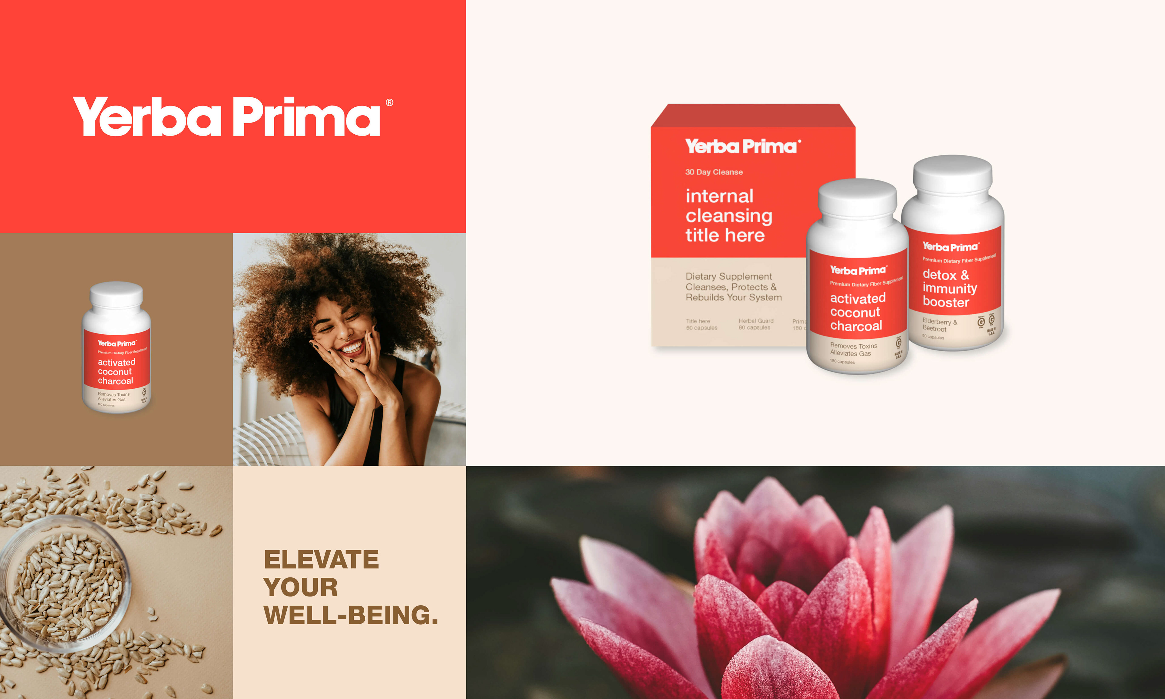
Mood Board 01 – Brand Energy & Wellness Tone
Mood Board 02 – Ingredient Clarity & Natural Cues

Mood Board 03 – Color Exploration & Differentiation
Mood Board 04 – Lifestyle Integration
Final Direction
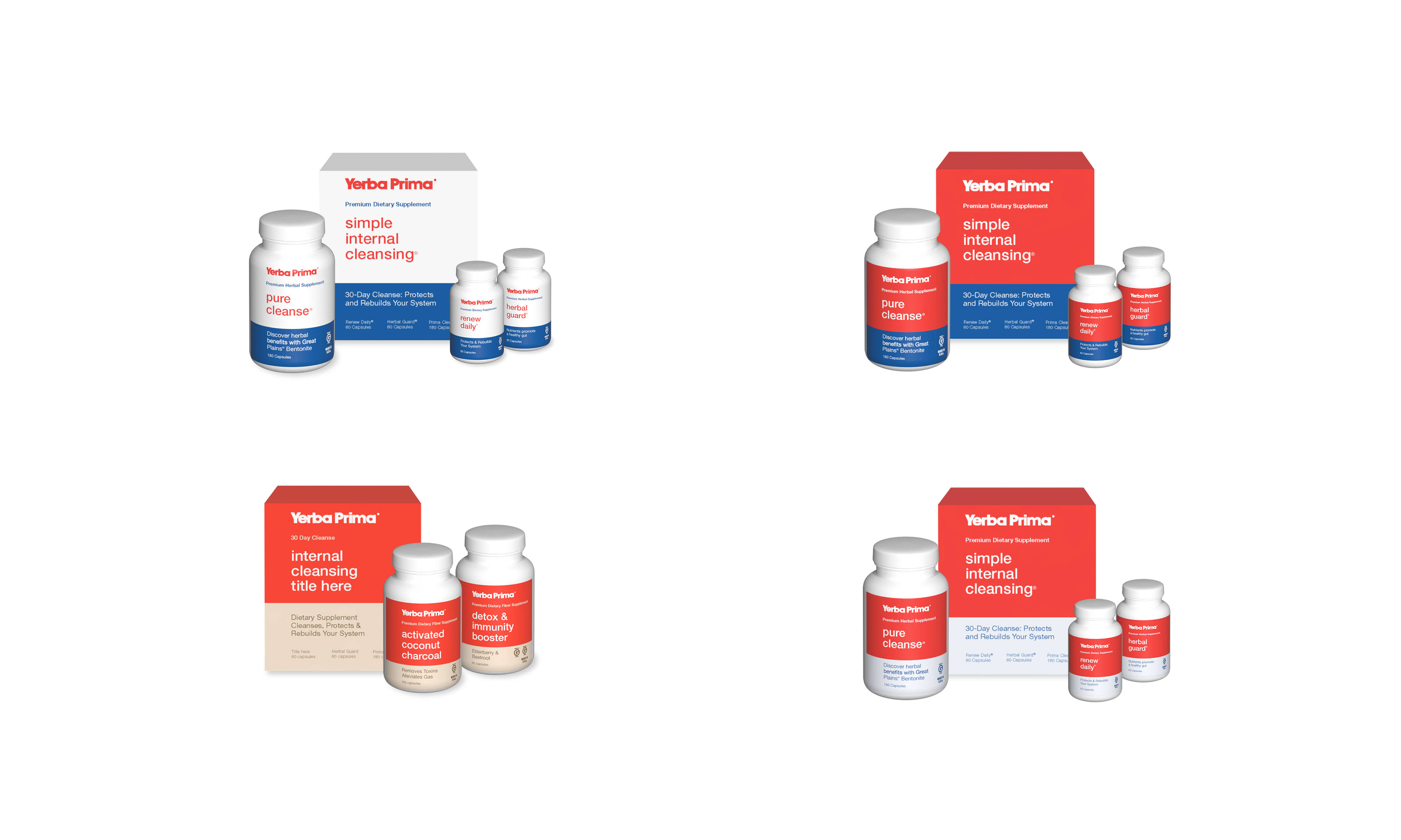
Packaging System Exploration
Packaging System Exploration
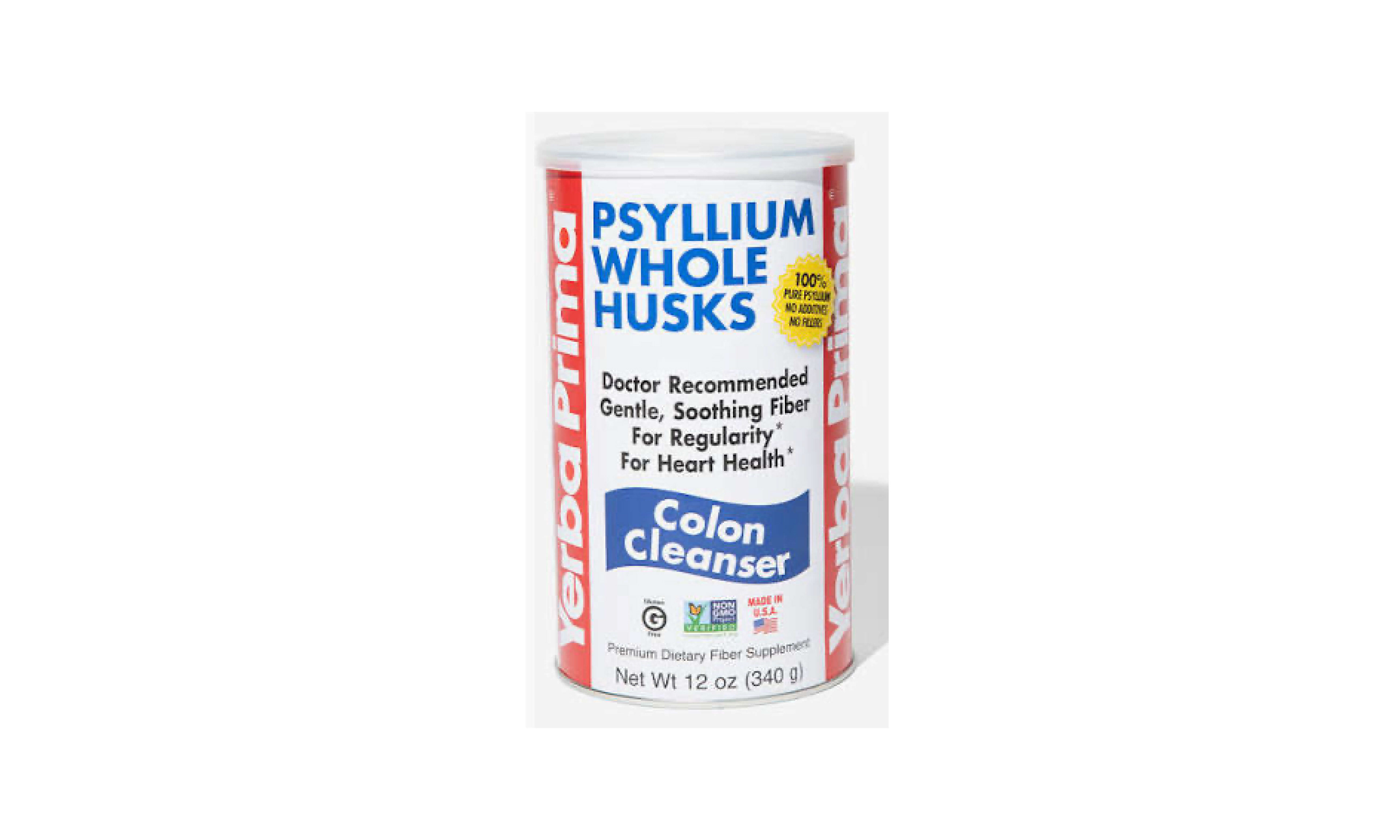
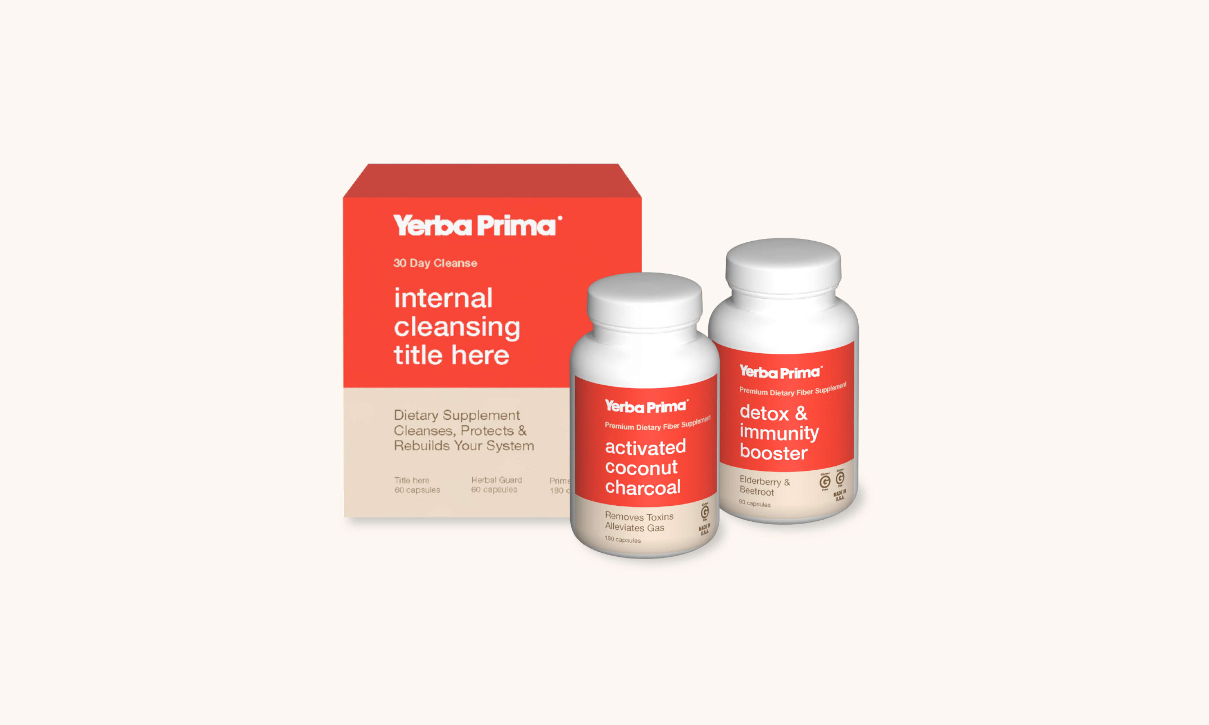
Original Packaging